Target’s private label brand undergoes packaging refresh

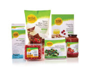
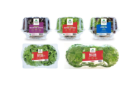
Target Corp.’s Market Pantry brand experienced a packaging refresh.
“Turns out, guests loved Market Pantry’s great taste, quality and low prices, but they thought the packaging designs fell a little flat,” says Amanda Irish, vice president merchandise manager, owned brands for the Minneapolis-based retailer. “Target’s known for great design, but the current, generic look and feel of Market Pantry just wasn’t reflecting that.”
Words like “basic,” “generic” and “plain jane” came up when guests described the current designs. So, a team of designers, merchants, engineers and marketers set to work giving the brand’s signature packaging a makeover.
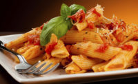
The answer was to listen to its guests. For example, in a survey conducted by Target, shoppers said that images of the foods on packages are really important when deciding what to buy, and that the Market Pantry product photos weren’t as delicious looking as they could be.
Consistency was also key, as consumers looked for a brand’s color scheme and trusted logo displayed prominently on packages to help the product stand out on the shelves.
It was also important to take different kinds of foods and their packaging needs into consideration. With so many types of packages to consider—boxes, tubs, bottles and bags—the brand’s visuals would need to be versatile. That meant building a far more expansive creative tool kit than what currently existed.
Ultimately, the team decided on a bolder, more joyful look for the new packaging that incorporated bright colors against a consistent red and white base, and varied background patterns that can be customized to fit packages of all sizes and shapes. They also used fresh, crisp photography and more expressive fonts.
“The new Market Pantry packaging allows us to communicate better with our guest through design,” says Irish. “Not only is it more attractive, [but] it [also] gives guests easier access to the information that’s most important to them.”
Looking for a reprint of this article?
From high-res PDFs to custom plaques, order your copy today!


