Litehouse unveils refreshing look for dips, dressings
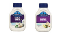
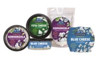
The new design entails easy-to-read flavor names in big, bold, contemporary font and vibrant color bands for quick and easy flavor identification.

Litehouse, Inc., Sandpoint, Idaho, announced a refreshed packaging design for its core line of refrigerated dips and dressings. Following consumer research and testing, the new design and color palette underscores the company's commitment to taste, freshness and real ingredients.
The new design entails easy-to-read flavor names in big, bold, contemporary font and vibrant color bands for quick and easy flavor identification. Custom, top-down food photography illustrates the real ingredients in every product.
"The employee owners of Litehouse take great pride in our products, and the new design highlights great taste, real ingredients and nutrition claims, as well as the versatility of our products, which we know is important to consumers," says Jim Frank, president and CEO. "We updated our branding with the consumer in mind, and invested in research to ensure the final product would appeal to brand loyalists and new consumers alike."
A modernized Litehouse logo prominently features the iconic lighthouse design and a more impactful brand name for improved on-shelf visibility, but the company's beloved glass jars and bottles remain unchanged. A "Crafted with Care 100% Employee Owned" message on the label further emphasizes the company's employee ownership and commitment to quality.
Furthermore, each dip and dressing label features a “Tasty Tip” to showcase product versatility and serving suggestions. The refreshed label also features the new Food and Drug Administration (FDA) nutrition facts panel and highlights product claims, such as gluten-free and no high-fructose corn syrup.
The new Litehouse packaging will be available in the refrigerated produce department at retailers nationwide by year-end. The initial refresh will focus on 53 SKUs in the United States, followed by Canada and Mexico.
Looking for a reprint of this article?
From high-res PDFs to custom plaques, order your copy today!


